


Painting
October 7, 2004
Ah, my dear little village of Mietraching. This is one of my favorite views near where I live: about a ten minute walk north from my village along a farm road that's used mostly for biking and walking. You can see the tower of St. Vitus, our little local church, which has existed in one form or another for 1500 years. In the foreground are the obligatory Bavarian fields, harvested for hay to feed the cattle. And the Alps form the backdrop. All is peaceful countryside.
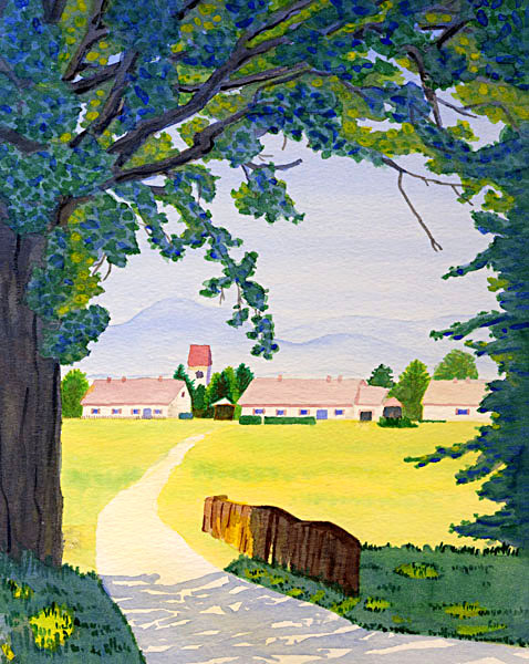
My mom sent me a couple watercolor magazines, and they have at various times inspired and demoralized. The two key bits of information that I glean from these publications is that watercolor is all about light and all about white. It is all about light because of the nature of the medium. Because watercolor is, by nature, translucent, it lends itself naturally to layering (technically called "glazing"). Each layer allows some portion of the underlying color through, so that glazing varying colors atop one another creates in turns, a bold, shimmering, vibrant, or delicate color. Watercolor is ideally suited for semi-translucent subjects, such as flower petals, window drapes, colored glass, and water. Beyond creating specific colors, glazing allows for fine control of the affect light has on an object or scene. I found that the artists whose paintings are printed in the magazine are very fond of backlighting as it creates starkly contrasting darks and lights, shadows, and highlights.
I chose this painting's subject and had started it before the magazines arrived, but the concept of focusing on the light really sculpts not only the design of the piece, but also the mood. It's a cheerful piece. And the vast amount of yellow in it gives it that feeling. It's bright and warm. I used a wet-into-wet technique on the grass, laying down a wash of yellow and then bringing in strips of green before the yellow had dried. This is clear in the middle ground, where the grass is still mostly yellow, but the grass in the foreground, in shadow, is also underlain by this same yellow. You can see it if you look carefully. And that is the magic (the magazines tell me) of watercolor. Even though I laid down a couple glazes of green and another couple of blue over that original yellow, it still glows through.
The buildings of the village appear a bit washed out. They consist of only one layer of paint. And I left them that way on purpose to convey the sense of a strong mid-day sun. The mountains similarly. But the foreground is a dense mixture of yellows, greens, blues, and browns, eventually all painted over by two coats of blue-purple. It's hard, really, to paint over lovely green grass or vivid brown tree trunk with blue-purple. It feels worrisome. I certainly don't want purple grass! But the magazines convinced me: thin (i.e. watery) washes of cool blues and purples and grays push objects back into the shadows. I made my fist very watery, and it worked. The foreground all pulled together as a cohesive unit and became more dull, drawing the viewer's gaze to the brightly-lit town instead of the tree foliage overhead.