Painting
October 12, 2004
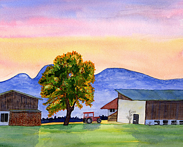
Bavarian Farm. This piece is actually a composite of a couple real images. The foreground is a real farm that sits at the top of a hill. When looking at it in real life from the viewer's standpoint, there is no background but the sky. However, this looks mighty strange and so I filled the background with the common image in these parts of the Bavarian Alps.

I actually made up a lot of this piece as I went along. I had planned out the scene, the objects, the design right from the start. But the lighting was tricky. In my reference photo, the foreground is lit with midday sun, not with the light from a sunset. At some point I realized that to really make this piece work, I had to incorporate the yellows and oranges of the sunset into the foreground. And to do that, I had to decided where the sun actually was. So, this image isn't really correct. Here we see the Alps, which lay to the south in real life. And yet the setting sun is casting last rays directly from the same direction -- south. Okay, so perhaps a little artistic license. If you didn't know the Alps are to the south, then it all works out fine. I actually painted the buildings and tractor first, in fairly light tones. But when I chose to have the sun backlighting the scene, I needed to throw everything into shadow. You see here several (four? five?) glazes of blues and blue-purples over the buildings and tractor and grass. The first few were tentative and rather clear, but the darker I made the buildings, the more vibrant the sky and lit grass became, so I added more dark.
I actually painted the tree last, with the idea that the yellows and oranges of the sunset had to catch in the leaves. I used a technique known as "lifting" in parts of the foliage, where I put down one color (yellow) and then another on top (light green) and then selectively blotted some of the top color off to show the color underneath. It worked quite well, I think. The tree may even go beyond simply catching the sunset colors and convey a sense of autumn. Which is fine with me. I think the orange against blue is vibrant and pleasing either way.
Previously


