


Painting
September 3, 2004
Continuing on in the same fashion: two pictures at a time; we come to the next that is finished.
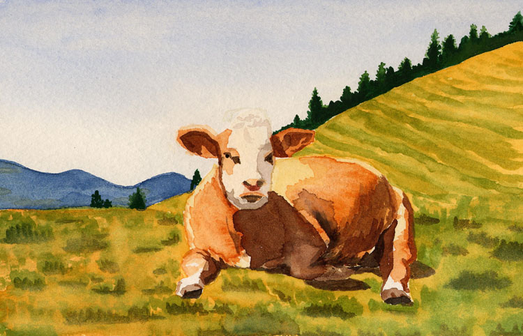
I like it. It's the first I've been overall taken with. It's definitely taken longer than the earlier pieces because I've done things differently. First, I started with the main subject instead of the background. It's much easier to create a shape than to draw around a shape with the subject only as negative space. Good art exercise, for sure, but hard. So I started with the cow and I started with a very very light color that is almost not a color: the white of the face. It's actually a little off-white. Enough so that I could tell the difference between the head and the background when I went to sketch in the shape of the body, which I did next. Again, I started with a very light color, which you can still see on the back leg, the top of the back, and the far left chest. With the form in place it was much easier to pay attention to color and not worry so much about the shape. I started layering on darker colors, letting some of them run together a little. I've found that if I let the first layer of paint dry a little, I can add touches that bleed together nicely without bleeding throughout the entire thing. I'm getting better and better with the amount of water I need on the brush to create one effect or another. I paid strict attention to the shadows and shapes of the cow, and thought at first that it was going to look ridiculous, but sure enough it looks right. Good idea to paint what you see and not what you think you see... Same with the cow's face. I tentatively ran strokes of the gray down the right side, all the time thinking about how it's impossible to erase paint. But it gives the effect of shadow, just right.
The ground was another success. I started with a layer of yellow. "But grass isn't yellow," I said to myself. No, but the underlying tones were yellow. Then I splashed in some green and some darker green in front of that green and soon I had 3D tufts of grass, no problem. The ground was a bit too bright yellow in places and so I went back over while the green wasn't quite dry and smeared some of the green into the yellow. The result: the grass is less distinct than the cow, but that's good. The cow is, after all, the center of the piece. I did the background mountains next, adding a few touches when it was almost dry, and then did the sky. I was nervous about the sky because the main problem I've been having is not mixing enough paint when I do large areas. I get 3/4 the way through and I'm out of paint. Then I have to go back and remix the color and while I'm trying to get the closest possible match, the paint on the picture dries and I get funny lines in the middle of what should be an even wash. So I made a lot of very watery blue. And then, as this was to be a graduated wash (which I hadn't done yet), I just dove in and did the whole thing as quickly as possible. I think I could have used a bit more color at the top, but by the time I was at the bottom it was too late for that. The final touch was adding the trees. They could have a little more definition, but I like them as dark green silhouettes, not attracting too much attention.