


Painting
August 29, 2004
And so the painting begins. I decided that this fall I would take up watercolor, fairly intensively. I've been drawing with pencil -- both black and white and colored pencil for, well, forever, but never really got into watercolor. Now's my chance. First day: about a week ago, I took my old watercolor set, watercolor paper, brushes, and accessories out to the nearby bench overlooking the Wendelstein. It was a nice evening, partly cloudy, and the visibility to the mountains wasn't bad. Well it was an interesting experience. I broke two tubes of paint, the (very old) paint having dried up in the mouths of the tubes. And hadn't planned well for taking everything home. After juggling various oddments covered in wet paint, I made it back. Here's the result:
It's pretty awful. So, here I'll critique myself, which will help me remember what I learn each picture. Let's see, mostly what I learned is that I need to be patient with watercolor. If I don't wait for sections to dry, then I either have to avoid them and paint elsewhere, or else suffer one color running into another. This happened here with the two layers of mountains on the far right (and in other places). I sketched the outline briefly ahead of time with pencil -- having done pencil all my life, it's hard to figure out where things go without an outline. But I really don't like the pencil in the final picture. It's possible, I suppose to maybe erase it, but I think I'm going to try to just not use pencil. Scary. I'm not thrilled with the bushes. They're so formless, although I do like the wet-into-wet ability to get highlights and shadows. I need to wait for stuff to dry to avoid white gaps (unless that's the style I'm going for). And I'm not thrilled with the mountains -- they're too monotone. The real mountains aren't quite like that.
Moving on. I decided that my old watercolors wouldn't really serve (especially minus a light and dark green), so I headed over to the local art supply store. I bought myself a box of twelve Lukas pan watercolors, and oooh! what great colors. Tube watercolors are supposed to have superior color, but these colors are quite nice, and pans are both easier to travel with and less wasteful. Besides, it's all the store had. I did have a bizarre experience with it, though. I did a sample of all twelve colors, and came to discover that the ivory black and the sepia were really the same color: black. So I took the kit back to the store, to show them that while the packaged pan said "sepia," it really wasn't. The girl there agreed with me that it wasn't sepia, and ordered some new sepia from their sister-store in Rosenheim. I went back the next day to pick up my new sepia, except this time there was an older woman there. She got the sepia from the back, and I requested that we open it there, so I could make sure that it really was sepia. Turns out it was the same color as my old "sepia": black. The woman smeared some on a slip of paper. "Yeah, sepia," she said pointing. But that's black, I insisted. I had brought my set of paints with me, so I had her smear some of my ivory black next to the "sepia". Same exact color. "Nope, that's different," the woman said. "This is sepia. This is black." The woman assured me that she had sold these sets to lots of people for a long time, and so it must be right. But how she could ignore the evidence presented to her very own eyes was beyond me. The emperor has no clothes. So I took my "sepia" home, not needing the "sepia" from Rosenheim, since it was the same color. And so I really have eleven colors, but plenty of black. I did a quick small sketch the next night to try out the paints for real and see if I had learned any patience yet.
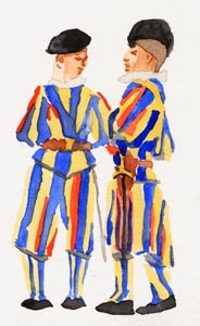
A couple of Swiss guards from the Vatican. No pencil, much better. I tried a wet lift on the face of the right guard and I like the result; it gives a sense of light. The face of the left guard I did separately with two different colors. Similar result. It was hard to wait for the colors to dry before putting in more stripes. A few stripes... wait twenty minutes. Repeat. I like the white of the collars being slightly off-white and the way the watercolor dries to create the hard edges there.
To stave off the boredom of waiting for paint to dry, I next started two paintings simultaneously. While waiting for one to dry, I worked on the other and vice versa.
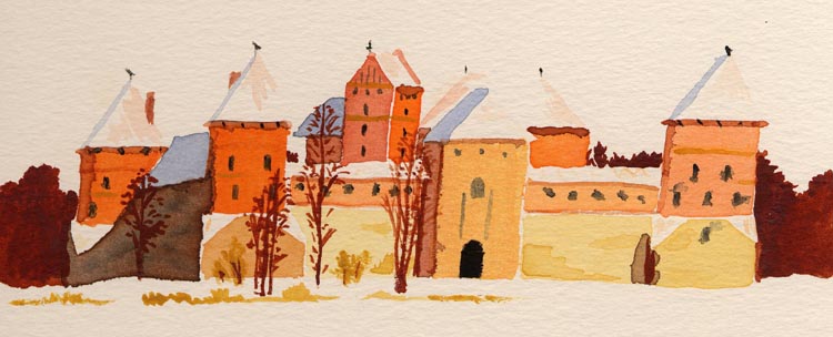
The first I finished is the Trakai castle in Lithuania. I didn't really notice it was leaning until I finished. My paintings always seem to lean to the right... Hmm. Again, no pencil. It was hard to start because of that. I did a pencil sketch first, which was a good idea, because it made me pay attention to the shapes and negative space and relative locations of things before I started painting. Then I painted in the bodies of all the towers. It was pretty cool like that actually: looked very impressionist with several orange squares and not-quite-squares across the paper. Drawing the snow without drawing the snow was hard. White -- the paper -- empty space, but also the foreground as snow. But I think it works. Again, in places I was impatient. On the gatehouse is a smudge of some brown that trickled in when I'd only let it dry for twenty minutes, and not the thirty or forty it needed. I also ran into trouble with the windows (see right tower). I had too big a brush and too much paint. Although the underlying tower was dry, it was too much paint and it spread. I changed to my smallest brush and it was better (see towers over on the left side). I like the dark trees on the right side, but they're not as good on the left. The shadow on the far left of the castle doesn't quite work. But I like the one on the right tower (though I didn't for a while). I played with the idea of giving the sky color -- a muted gray, say, which would bring out the white of the roofs, but I decided against it. I kinda like the white-on-white look. And I'm happy to report that I'm getting a better feel for the paints, how much water I need for a given item, and how they behave on the page.
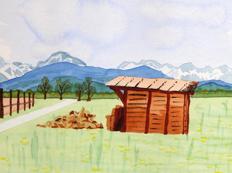
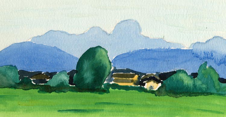
The second contains lots of experimentation..It's the wood shed along the path I bike to work. I didn't do a sketch first, and that was probably a bad idea. The shed isn't quite the right shape, and proportions are off throughout. Again, the shed, which is upright in real life, leans to the right. There are a few things I like: I really like the effect of the light slate-blue for the mountains on the right. The blue of the ones on the left is too dark. I like the hills being layered in successively bluer and grayer tones. It's what they look like, after all. I like the trees in the background. Easy to do and watercolor-esque. Critiques: I hate the vertical lines I put in the grass. Sure, the grass is vertical, but these lines are too long and they just look weird. I don't like the wet-on-wet attempts I made at clouds; maybe they're just too big, but I think they look crappy. The boards on the fence are too plain. They need some light and shadow, perhaps. The woodpile is okay, but kinda abstract. I like the shading on the shed that I put down as an undercoat. But the black cross-lines are too big and dark in some places. I like the lighter suggestive strokes better. I like the shading of the wood at the entrance of the shed. The shed's roof may be too monochromatic, like the fence's. And the path should get smaller as it wanders to the distance.